
The terms “mobile-friendly” and “ mobile-optimised” are often used interchangeably to describe a website design mobile users can easily access and navigate. However, mobile friendliness and mobile optimisation mean different things.
All mobile-optimised websites are mobile-friendly, but all mobile-friendly websites are mobile-optimised.
In this article, we differentiate the two and list down the key benefits of having a website that is optimised for mobile users

Mobile Friendliness
A website considered “mobile-friendly” accurately displays on smaller screens like smartphones and tablets. Think of it as a slimmed-down version of the desktop. No need to squint or zoom in — the texts, images, buttons, and links are large enough for viewing and tapping.
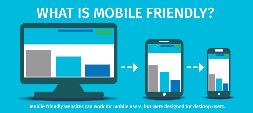
Mobile friendly is a bare minimum mobile design strategy. While it can be functional for mobile users, they were designed for desktop users and didn’t use the “mobile first” approach. They’re not designed to maximise user experience, improve search rankings, or convert mobile traffic into leads or profits.
Mobile Optimisation
A mobile-optimised website, on the other hand, goes a step further. Though it sounds similar, it’s actually a more complex design technique than being merely mobile-friendly. It is designed and built using a mobile-first approach. With mobile optimisation, the site is designed and built using a mobile-first approach and reformats itself for mobile users.

Not only does it make sure to properly display on smaller screens — but a mobile-optimised website is also much easier to navigate. It reformats content, displays larger navigation buttons, and optimizes images according to screen size. They are designed for mobile users, who navigate, read, and act differently on a website than those who are viewing a desktop.
- Single column layouts
- Large texts, buttons, and other touch points.
- Little need for typing
- Easy, simple navigation that is “thumb” friendly
- Reduced overall features to eliminate the clutter that interrupts the quest for critical information
- Graphics that use white space borders
- Formatted content for maximum readability
- Fewer pop-ups
- Loads quickly
What are the key benefits of having a mobile-optimised website?

Want to upgrade your website from being simply “mobile-friendly” to being “mobile-optimised”? There are several reasons why you should start paying attention to mobile optimisation:
1. Mobile searches are on the rise
Did you know that 61% of organic searches come from smartphones? This finding from Statista, backed by other research findings further asserts that mobile use is on the rise. Thus, your brand or business needs to level up your mobile SEO game.
Since mobile searches are rising, there’s a big chance you target potential customers searching for content or product via mobile devices.
2. Mobile optimisation can help with your search engine ranking
Gone are the days when mobile SEO did not affect your regular SEO — due to the rise in mobile searches today, Google has begun factoring a website’s mobile SEO into their regular SEO. According to this digital marketing agency, a website that can be accessed from different devices is crucial to Google and other search engines.
3. Mobile optimisation boosts your website speed
Websites that aren’t properly optimised for mobile often take ages to load, especially the ones using Flash elements. The problem is mobile users don’t have that much time and patience to wait and tend to leave before even discovering what you have to offer.
On average, you only have less than 3 seconds to impress a mobile user. Optimising your website to meet mobile standards makes it load quickly. By improving its speed, more visitors are likely to stay and navigate your website for longer periods.

4. Improves user experience and engagement
You’re probably aware that user experience is key to retaining visitors and converting them into customers. However, the mobile user experience is much different from the computer user experience. Mobile users navigate on a small screen so should be able to click links or read texts without zooming in and explore the website with ease.
5. Decreases bounce rate and increases the time-on-page rate
Bounce rate refers to the percentage of single-engagement visits to one’s website. Google Analytics tracks the number of visitors coming to your page and leaving without viewing any other page on your website. In other words, when your webpage has a high bounce rate and a low time-on-page, your webpage is not in a very good place.
Since mobile optimisation helps you improve the user experience for mobile users, they’re more likely to spend more time on your website and engage in a meaningful way. The longer they stay and engage, the more likely they are to convert and return again.
6. Better geotargeting
Geotargeting (also called geotargeted advertising or marketing) is a type of advertising or marketing to certain individuals based on their location. It includes using location data to reach consumers with messaging or content appropriate to their locality and behaviour, It also helps bridge consumers to businesses near them.
Mobile optimisation is crucial for geotargeting. Mobile users should be able to access your website from their phones, or they’ll move on to the next website that could cater to their needs.
Author Bio: Carmina Natividad is a web content writer during the day and a foodie, musician, coffee connoisseur, and plant mom when her day shift is over. She enjoys sharing her insights about blogging, web design, SEO, and other forms of digital marketing. To know more about digital marketing, check out the blogs of SPRINT DIGITAL Agency Dublin.